Showing posts with label char. Show all posts

Sunday, 18 August 2013

Zoo nails

Having a somewhat childish motive on my nails makes me happy. Yes, I'm easily amused, but to be sat at your computer and suddenly realizing that you've got a zoo dancing over the keyboard is pretty amazing. 

I can't remember what it was that triggered the idea of a zoo. It might have been that I wanted to do the pandas again and that I came across the idea of the giraffe somewhere. 

Which one is your favourite?


Sunday, 28 July 2013

Social media & operating systems

As you might often notice, I try to get my inspiration for designs for upcoming events or trends. Especially now when I, for some reason, haven't got that much random inspiration the events become even more important and one of the bigger one in my calendar was a hackathon with work.

How do you make a design for a hackathon? The idea of using different logos related to tech has crossed my mind and now seemed like a great time. Said and done, one of the categories at the hackathon was social medial so the left hand nails were decorated with well known logos: facebook, twitter (a very fat twitter bird), reddit, a black&white instagram and Google. Yes, Google was in this case counted to social media. 

The right hand had three easy choices: the Linux penguin, the Windows flag and the Apple apple. I wasn't very keen on breaking the OS trend I had going and it took me a while before I remembered that I could use the Android alien too. Sure, the apple and the little Android-man weren't the best, but that detail on right was easier said then done. For my thumb I opted for Cisco, a hardware company which is mainly known for their routers and switches, or in dummy terms the hardware that the Internet uses.
 Main conclusion from this? If you've got time and patience you can get far in nail art with a toothpick! Yes, it's far from perfect but in most cases you can guess from the context.

Saturday, 20 July 2013

Dripping colours

Bright colours, playful with a dripping effect. All details done with a toothpick, make sure to have patience for getting the shapes right!


Monday, 15 July 2013

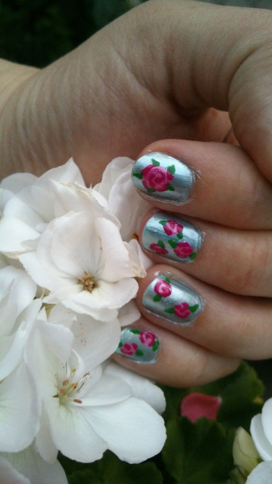
Roses, roses, roses

Summer, I finally got summer! After some chaotic weeks in England it was finally time for my holiday back in Sweden. One of the best ways of telling myself that I now had more time was to sit down and do a proper, more detailed design since a few weeks back. However, I lacked some creativity and it look a while looking at the surrounding garden before the roses came to mind.

I've admired this design many times before, at first glance it looks rather tricky. But, looking closer, it's not that much harder than most others I've done. My biggest challenge this time was to find the right shades of pink!

To make this rose, find a base colour and make blobs for the flower. Then take a slightly darker shade and draw three lines - two along the edges (but only part-way) and then one which makes a small twist in the middle. Finally, using green paint a leaf on each side. Voila, you've got a rose!

Sunday, 9 June 2013

Return of dots & entry of nail caviar

Dots, dots, dots. They're a very good fall back option when you're out of ideas and can be varied in both layout and colours, essentially giving you an unlimited number of designs. The first picture below is a combination I've used before but this time in a more stamp-like pattern. I failed completely at taking a picture of the full design, so I only had this one with my (now broken) iPod.


This second design is a bit more elaborate. I was given quite a bit of nail caviar for my birthday but I've been a little sceptic to how long it will last (especially given my current training schedule). On the the other hand, since I now had so much of it I figured I should give it a try. I couldn't find a colour from my collection which matched the caviar perfectly, so opted for three shades of blue. Luckily, the dark blue has aged enough that it's not as runny as fresh polishes are, meaning that I was able to make some smaller dots with it.


I have yet to see how long this caviar lasts, if it's good enough I may start using it more often.

Super Mario

I'm going through a phase of failing at taking pictures of my nails. I'll often do it just as I've finished, but before I've cleaned up but then forget to do it before they fall apart. You'll just have to bear with it :)

Super Mario design was something that we first came up with as an interior thing. Gema, a friend of ours and I ended up browsing the internet for how to furnish a flat in all gaming/geek related stuff and there were some brilliant Super Mario pieces. Since I don't really have the money to carry the project through, it became a nail art inspiration instead.

It's been on my to-do-list since we started planning our Avenger designs and I've occasionally browsed through what others have done. Some projects are well impressive, partly because they've got such long nails and can fit a lot more.  I loved all the mushrooms and couldn't resist including Mario & Luigi (the moustaches were surprisingly hard!). I didn't feel I had the accuracy to include the monster flowers or make a tube look pretty, so ended up with a turtle shell and the chance-box's question mark.

Unfortunately, the nude I was using didn't last for very  long. It was a shame, since I was rather pleased with the final result. Apart from the moustaches (which I now realised would be much easier with a nail art pen) there weren't too many details to fiddle with, so do give it a try!


Monday, 27 May 2013

Dandelions

This is a design which has been in my backlog for a while. In the original inspiration they've used a very pale grey as a background and also managed to get the "leafs" (or what you call the things coming off the flowers) like normal brushstrokes. I, on the other hand, do not have that set of brushes and compensated by trying to make some of the strands slightly bluer.

It's a very calm design, both motive and colour palette. I found it a great work design (for stricter offices than mine maybe, most of my colleagues like pretty much all of my designs and have even come up with various idea). Even looking at it made me calm down a bit, which at times can be quite useful

For the white details I used a toothpick, the black was done with my nail art pen. Base is a Loreal that I've used before - I love the colour but it's still very tricky to work with (requires two layers or more and dries slowly). But as said, great for work if you're looking for something that isn't just single colour.

Black stripes


My flatmate had come across this design on Pintest and asked me if it was hard to make. To give her a bit of a revision break I volunteered to give them a try. Now, they probably would have turned out better if I planned ahead a little. Rather than starting with the top stripe, ensuring that it reached the end of the nail, I kept starting with the bottom one. Other than that, it's a very straightforward design for the one looking for something a bit whacky but with limited amount of time (base coat, then use a black striper - or other colour for that matter!).

The idea of using only the transparent base coat and not a covering colour is interesting, could be good to keep in mind for other designs.

Thursday, 23 May 2013

Swirls of pink and black

I have times where I don't have a lot of inspiration, or time for that matter. This was one of them, even if I in hindsight could have gone for a much simpler design. I wanted to try out the pink nail art pen (topshop) combined with a silver base (Barry M). The silver is one of my favourites and works to pretty much everything. 

When I completed it, I realised that it would probably have been much cooler if I just had stripes but in alternating black/pink. I guess I'll just have to keep that idea in the backlog with the conclusion that this colour combination definitely works!

Wednesday, 22 May 2013

Alice in Wonderland

A friend hosted a Mad Hatter's party a while ago, which opened a great opportunity for design. It was first suggested that I should try something like this one, but that felt like a challenge way above my skills. The regular research started and I fell for this as the source of inspiration. Whilst I didn't have any pearls or other decorations for the 3D effect much of it could be done with the much trusted toothpick and a black nail art pen. 

As a base I've used Loreal's French Riviera, a lovely colour but tricky to work with. It definitely requires at least two layers and is sometimes hard to paint even with. It also takes a while to dry, so at the end of the day it's a fair amount of effort for the colour compared to many others!

 All the black details were done using the tip of the nail art pen from TopShop, white was done with a mixture of the normal brush and toothpick to get the edges right (circles are tricky!) and the eyes were done using the home made dotter. The cat is meant to be Cheshire cat that can make itself invisible.

Unfortunately, I only got around to taking pictures when the design was falling apart, hence the index finger looking a bit messed up. As you can see I deviate a bit from the original design by changing the bow tie for the smiling cat and the hat. Especially since I didn't have the physical decorations it ended up as a good compromise. 

Index fingers were time consuming and the base layer's drying time but still think I completed it in 1.5h! 

Monday, 6 May 2013

Roy Lichtenstein - WHAM, POW, BAM!

Roy Lichtenstein is currently on display at Tate Modern, a great exhibition with not only his classic comic art but also other tangents throughout his career. I went to see it a few weeks ago and loved it; the descriptions of how he'd taken comic strips and not only enlarged them but also stripped them of "unnecessary" details helped bring out the brilliance of the paraphrases. The exhibition ends on May 18th, but if you do have time to go I highly recommend it!

The comic art theme, and sound effects in particular, is something I had come across in one of my main sources of inspiration: The Wha Nails Book of Nail Art. I was originally browsing for designs where I could use a red background since I wanted to enter a competition in InStyle when I came across it anew and couldn't help but to make the connection.


When I was doing the left hand, I planned on doing the dots after the bubble/explosions, but realised it probably wasn't a very good idea. I also liked the plain background, even in contrast to the dotted right hand, so rather than starting again I kept it.

My base coat here (on top of my usual Sally Hansen Diamond Strength) is nails inc's It's red, babez that came with an InStyle magazine. Whilst I have multiple red shades already, I knew that my only lighter alternative is reaching its end so it couldn't have arrived more conveniently! The outlines of the explosions were first drawn in white with a toothpick, and then filled with the normal brush. For the black contours and text I took the tip of the nail art "pen" I bought from Topshop (which almost immediately blocked up) and simply used it the same way I would with a toothpick.

Finally, I couldn't resist taking this picture. Yes, the text on the right hand is a bit squiggly, but a thumb which says "BAM" was just too good to resist.


Fishy, fishy

Gema has in a previous post introduced a colour changing nail polish she got her hands on whilst in the States. She was kind enough to bring one back for me too, but I haven't had time to try it out until now and I was also lacking design ideas. Starting off with the incredibly broad search term "ice blue design" I came across a few sea themed designs and couldn't resist trying it out.


I think I may have a minor crush on the shark below. It was brilliant typing, as it looked like my keyboard was under constant shark attack (yes, I'm rather easily amused). In addition to the base colour Del Sol - Electrick I used Kiko's holographic grey and then normal black and white. Eyes were done with pin-dotter and other details with a toothpick.


The octopus is Maybelline's Colour Show - Purple Gem and the crab is TempleSpa's Monaco. Unfortunately the white dots got a bit mis-coloured in the sun but overall the design was well received!

Saturday, 27 April 2013

Birds at dusk


Another one in the series of "I want to try my new colours ASAP!" Base is from Maybelline's Color Show Series and is called Purple Gem. The birds were done by drawing with a toothpick, meaning that some of the lines got squiggly or bumpy. To break the "birds sitting on a line" pattern I decided to paint "foot traces" on my ring fingers. The design was mimicked for left hand.

Dotted lines


I recently went off and bought some new colours, all of which I was very keen  to try out. These were two of them, Papaya from Berry M's Gelly series and Grey Matter from Rimmel London. I was unsure of how to combine them, but then came across this design of three dots with (at least attempted) decreasing size. Ring-finger designs have long been popular but because I was unable to decide which way around to flip the colours, so I did one hand of each.

The gelly polish isn't all that easy to apply since it easily becomes too thick. The grey one, however, has a really nice brush. The design is good if you want something plain, even work appropriate but still a little more than a single colour.

Thursday, 11 April 2013

XKCD - because we are geeks

Have you ever come across XKCD? It's a brilliant online comic, occasionally (read: often) very geeky, written by the equally brilliant Randall Munroe and goes with the description "A webcomic about romance, sarcasm, math and language." It also has the following warning message: 

this comic occasionally contains strong language (which may be unsuitable for children), unusual humor (which may be unsuitable for adults), and advanced mathematics (which may be unsuitable for liberal-arts majors).

Amongst my uni friends it's commonly used for procrastination or random references and hence something I read regularly. Because it's mainly stick figures I couldn't resist trying it out as a nail design. I only found one other person online who'd tried it, so it was easier to find my own favourites with a bit of help from friends. 

I spent a fair amount of time sketching ideas. This included thinking about what would fit on a nail, which ones could be recognisable to regular readers etc. When asking around, Click And Drag came out as a big favourite, a strip which caused the geeks of the Internet to dance of joy. Because the image is huge, there was a lot to choose from, but most wouldn't be very easy to fit on a nail either in size or detail.
In the end, I opted for the following comics on my right hand: thumb, index, middle, pinky. The man, who I refer to as "hat man", on the ring finger appears often, so I decided not to note which comic this pose was taken from. The computer is admittedly also frequently recurring, but I remember writing that one down since it included more details.
On my left hand I tried including previously mentioned Click and Drag by drawing the balloon-flying character over ring and middle fingers. The pinky was used to type out the comic name, for those who might not recognise it (I was unlikely to forget myself), and on the index finger I went for this one.
On the right thumb, I tried drawing one of these guys but I was a bit too keen when adding the top coat so it smudged. I tried with the velociraptor from this one but would have needed a steadier hand (hence it not being shown).

As base I used Rimmel London's Grey Matter and drew with a nail art pen from Topshop (which unfortunately, after one use, has managed to dry up. It might have been cheapish but I expect more than that from Topshop!) Colour details were done with Sharpies.
I'm really sorry about the rotation, Blogger auto-rotates it for me but doesn't give an option of changing it back.

Leopard nails

Did you know that leopard dots were Gema's first design? I think it was about a year ago she tried it out, but I haven't got around to it until now. Why I don't know, I got distracted along the way.

The reason I decided to do them now was thatI wanted a fairly neutral design for when starting a new job. I've been told that many companies wouldn't be too happy with their employees using their digits as mini-canvases but luckily that is not often the case in engineering. 

The base colour I'm using is Mint Choc Chip by 17, a lovely colour but not very good quality - it chips easily. For the dots I used our beloved pin (from sewing kit) and then I drew around them with a permanent marker. As I applied the topcoat the marker smudged a lot more than I expected, which worried me, but at the end of the day it actually helped the design.

Pastel colours are also a great way of reminding yourself of the upcoming (sometimes visible) spring!

Wednesday, 27 March 2013

Easter Nails

Easter is approaching, and how can I possibly resist doing a holiday themed design? Add to it that I've been stuck with coursework for a long time and hence hasn't done anything exciting in design way.

Originally, I was planning on doing a few Easter Eggs and a chicken, however I went through some other designs and I couldn't resist falling for all these spring colours. Sweden is currently offering a lovely spring sun (unlike London, from what I've heard) so it fits well. For details about the different designs read the picture captions; my right hand is a mirror of the left with some shuffling around of the colours.


Background: 'Blue Ice' from Gina Tricot, white is from Natural Collection, black eyes are drawn with a Sharpie whilst the pink details are done with a toothpick and a mix of the white and Barry M's Pink.

Turquoise from Technic (in a set that was given to me), pale purple is Shade no 11 from 2true, yellow from Barry M and coral is 'Tropic Island' from Lasting Fix. Details on the egg (ie the edges) were done with a toothpick, dots were made with a pin and tiny details on the chicken with a Sharpie.


Happy Easter everyone!

Thursday, 14 March 2013

Party Nails

One thing that I remember finding tricky to find online is party nails, or at least last time I checked I was put off by the top results as too tacky, too difficult or not party enough (or at times, too much party). However, when I got Kiko's grey holographic polish and there 2012 Holiday Glitter I had a great colour combination to base a suitable design on, so off it went.

I had a party coming up and we'd been asked to put cocktail dresses on, so it gave me an opportunity to try it out. I had originally planned to just use the holographic as a base and add a glitter top coat on the ring finger, but changed my plan. To have a little more "happening" in the design I decided to try a triangle pattern.

I started off with the grey base and then cut triangular pieces of tape to place with spaces in-between (for alternating triangles). This way I would have alternating glitter and grey triangles. I have mentioned it before, but I'm going to stress it again: if you decide to use tape, it's important that you let the polish try completely first, as it will otherwise leave marks, and allow longer time for drying before removing it as well. The tape technique also has a tendency to create very sharp edges and the glitter polish's structure enhances this. TTo even get a reasonably even surface, I applied two fairly thick layers of top coat, using Sally Hansen's Diamond Strength Base & Top Coat.

I'm really happy with how it turned out (especially after the time spent doing it)! The contrast between the warm colours of the glitter and the cold grey works well and are going to complement the champagne coloured dress I was wearing (with red details).

Party nails - glitter triangles


Thursday, 7 March 2013

The Avengers Assembled

It's little less than a year ago that The Avengers Assemble movie came out, but as you might have heard most of our super heroes are returning with solo movies (Iron Man 3; April 2013, Thor 2; October 2013, Captain America 2; April 2014) . We are both huge fans and have for a long time been planning on doing The Avenger nails, now is finally the time.

As you can see we opted for slightly different designs, Gema's longer nails allowed her to paint whole faces whereas Charlotte went for her good old favourite of splitting the design between the two hands.


Charlotte's nails:

I have used the digits for the characters, well aware of having to drop one (Black Widow in this case, since I couldn't find a good enough design and it annoys me a bit that her sole purpose in the movie appears to be sexy). The thumb was left to carry the Avengers' A on a pale blue background.

For all the black details you can see I used Sharpies, also for the red stripes on Captain America's body. Any white details were done with a toothpick and so we were also the red on Iron man's head. The silver detail's on Thor's armour were done using a home made dotter (ie a pin stuck in a rubber) and the As on the thumbs with a silver striper from Primark.

Assembling the Avengers

Gema's Nails:

I tried to fit in as many characters from The Avengers movie as possible! For the thumbs I did black A's on a glitter background as a slightly different Avengers logo.

On my right hand index finger I did Captain America. I used the Peacock Green holographic polish by Kiko for the colour of his blue suit. I then added his A logo on his forehead and face detail with a combination of toothpick and sharpie fun.

On my right middle finger is Iron Man. The gold foil by Barry M polish is the background. Then completed his armour by adding red polish and some red craft glitter to give it a more metallic look. Face details I used a Sharpie.

On my ring finger is Thor. Voodoo by L.A. Colours is the green background (which I also use for Loki on the other hand). I also used silver foil by Barry M polish for his helmet and neon yellow for this golden hair.

I decided to go with the Avengers movie version of Nick Fury on my little finger (pinkie) using silver foil Barry M polish for the background and drew in the detail using a Sharpie.

Nick Fury | Thor | Iron Man | Captain America
On my left hand index finger I used the comics representation of Hawkeye which is a mainly purple suit with a H logo on his forehead above a face mask. I used a Sharpie to outline the details and then filled in the H and mask with purple craft glitter.

On the middle finger is the hulk. I used a neon green for his face and added the rest of the detail with a toothpick.

On my ring finger is the mischievous god Loki. I used the same Voodoo green background as Thor and then Barry M gold foil to colour in his striking head gear. I added a big of gold glitter on top of that to aid the strikingness...

Little finger is Black Widow. She was a tough character to do since her logo is the common marking of the black widow spider in the comics however this is usually a small feature around her waist. I wanted to continue with the faces theme instead of just doing her logo or a black widow spider and based it mainly on the movie representation of her.  

Hawkeye | Hulk | Loki | Black Widow
Am looking forward to The Avengers 2 in May 2015 with the hinted villain at the end of The Avengers Assembled, Thanos as he would be an interesting character to attempt in nail art.

Assembling all our Avengers together ^_^

Mass Avengers Assembling

AAAA


We hope you liked these ^_^

- Nail Art Love -


Sunday, 24 February 2013

BUCS Championships

A great deal of my time is spent on fencing related activities: trainings, competitions, fencing friends, running the fencing club etc. This weekend it was time for the BUCS Individual Championships, which is the only individual event that BUCS hosts over the year (otherwise it's all teams), and I decided to match my nails to the event.

As inspiration for the digits, I used Sport Imperial's logo (the body which the fencing club is a member of), and wrote "BUCS" on one hand and "ICFC" (Imperial College Fencing Club) on the other one. It was a bit messy, especially any letter that is round(-ish) was hard to write nicely. It didn't help that my white polish was running out. 


For the thumbs, I painted the outline of a small fencer. For someone who doesn't do the sport, it turned out to be a bit unclear what it was, but fencers really appreciated it. At the hotel the night before the competition, I attempted to do the same design on one of the other girls, but we could only find a plastic spoon to use as a tool, so it got a little messy. One of hers definitely has fencing thighs though!